EDITIONEN & PAPIER
Images of the Exhibition
Description
With the exhibition “Editions & Paper,” Galerie Wolfgang Jahn presents nine artistic positions in which ideas and pictorial concepts take shape directly on paper. Here, paper is not a preliminary stage but an autonomous picture carrier. The show brings together internationally established artists with younger, distinctly profiled positions. Featured are works in varied techniques and artistic signatures – from gestural, process-based paintings to expressive figurative scenes and reduced, constructive compositions. Drawing, pastel, acrylic, mixed media, woodcut, pigment print, and experimental procedures, such as Jiří Georg Dokoupil’s soap-bubble paintings, demonstrate how individually working methods and artistic handwriting unfold on paper.
This becomes particularly vivid where the image essentially arises from the movement of color, as in the works of Jiří Georg Dokoupil, Hubert Scheibl, and Laura Aberham. In Dokoupil’s case, translucent soap bubbles form the basis of image generation. Iridescent, marbled deposits in intense hues or nuanced blues settle on the paper as color formations whose clear contours emerge from the edges of bursting bubbles. Organic forms reminiscent of cellular structures overlap and interpenetrate in a rhythmic dance, with the lightness of a moment that might vanish the next instant.
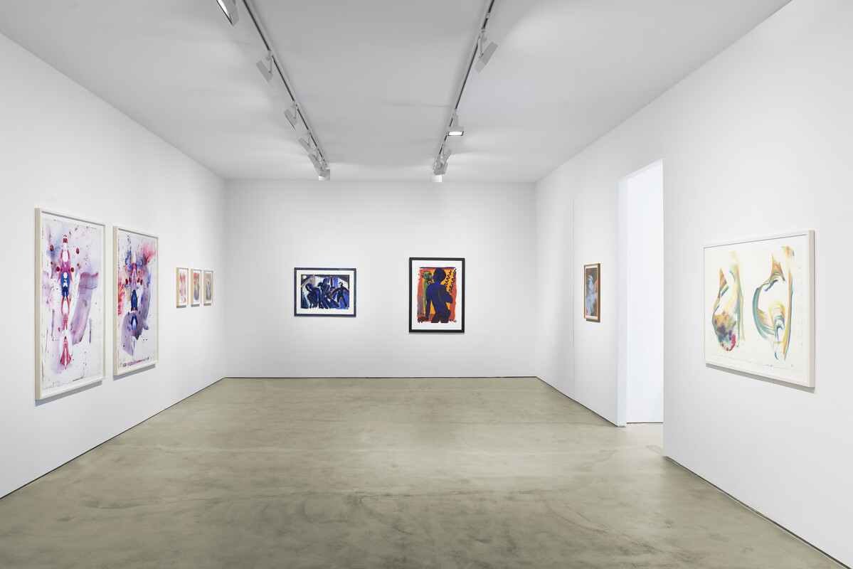
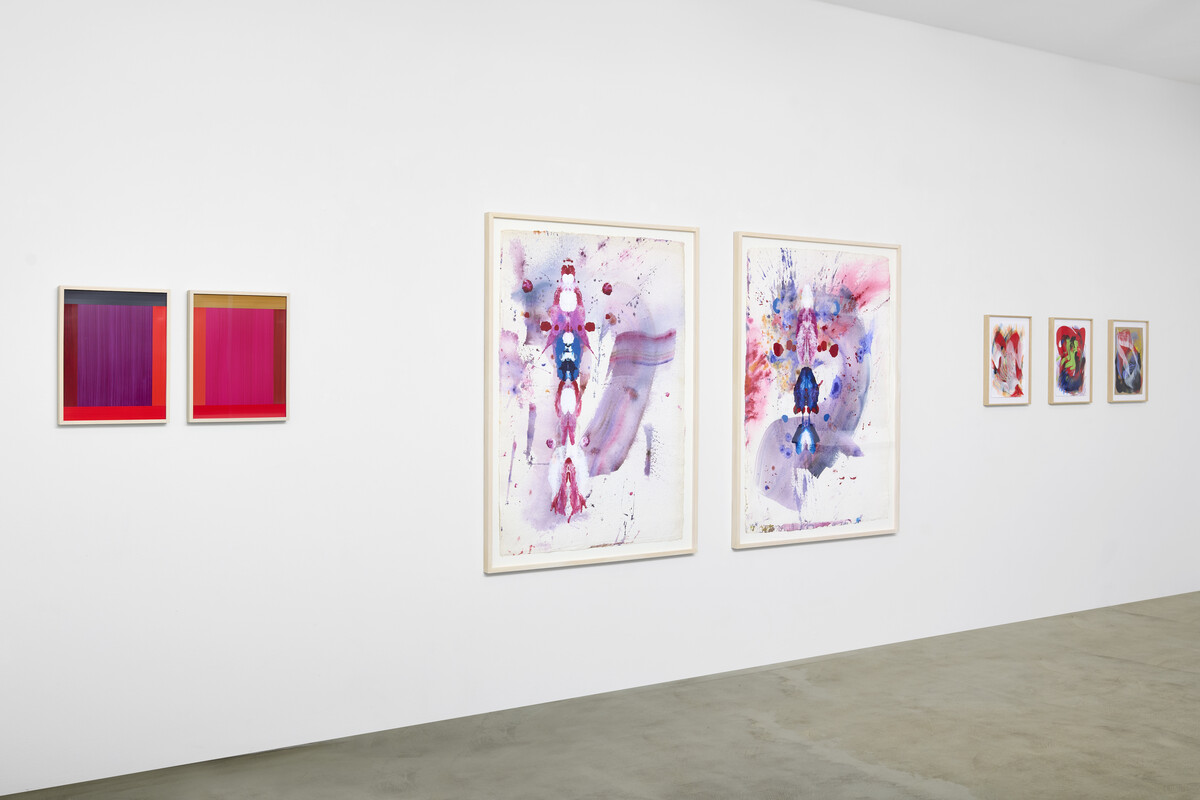
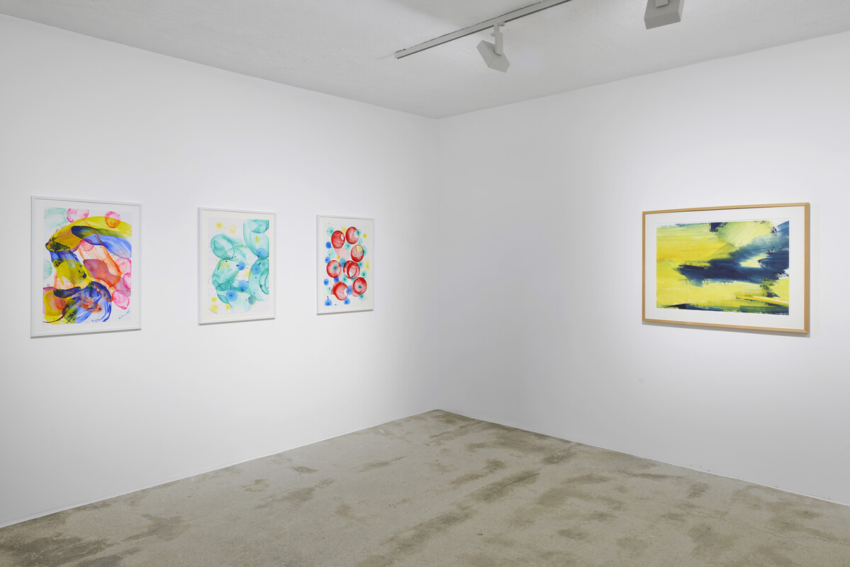
For Hubert Scheibl, it is flowing layers of color from which pictorial spaces develop. Delicately translucent gradients meet denser, sometimes blot-like concentrations. Formations organized along an axis evoke reflections without being strictly symmetrical; there is a recurring suggestion of Rorschach figures, in which spontaneous interpretations attach to symmetrical color forms. Titles such as “Plants & Murders” allude to growth processes in nature, to the cycle of emergence and decay. In works like “Ones,” the color bodies gather into central formations that grow into the pictorial space, oscillating between expansion and definition through layering and superimposition.
Laura Aberham extends this process-oriented approach into a distinctly gestural painting on paper. The proximity to Scheibl’s “Ones” is evident in the arrangement of color forms and in the movement field circling around a center, while she introduces other emphases. Broad brushstrokes sweep across the sheet in arcs and counter-movements, overlaying one another, breaking off, and beginning anew. Luminous reds, oranges, and blues appear alongside more muted greys and violet tones. Gestural marks condense into nests of color, crossed by lines and pastel gestures that connect the surfaces like fine seams. Concentrations, directional shifts, and turning points in the painting thus become directly legible on the paper.
A different form of immediacy appears in the works of Rainer Fetting and Helmut Middendorf. Both sheets belong to the context of Berlin painting among the “Junge Wilde” and exemplify their intensely heightened painting on paper. In Rainer Fetting’s “Ricky” (1983), a figure stands frontally before a colored background as if looking into a color-distorting mirror. The body emerges from broad, energetic areas of color; face and posture remain sketch-like, and the figure’s presence results from the contrast and rhythm of the brushstrokes. It is about quickly grasping form and mood, not about detailed elaboration. The reduction to essentials intensifies the impression of a painterly psychogram.
Helmut Middendorf’s “OT (Nacht)” (1979) varies this attitude in a darker register. The narrow figure before a high-contrast pictorial space, the single-gesture application of dispersion paint, the sharp separation of light and dark, all of this creates a nocturnal, urban tension. In the rawness of the paint application and the angular drawing, a deliberately unvarnished, non-conformist visual language emerges that opposes smoothing conventions.
The stance of heightened painting developed in Berlin finds a parallel expression in the works of Bernd Zimmer. Associated with the Munich “Heftige Malerei,” Zimmer translates the energetic application of color into observations of landscape, light, and vegetation. In the series “Himmel,” “Reflexion,” and “Blühend,” vertical bands, horizontal fields of light, and rhythmic transitions become carriers of perception. Nature appears not as a topographically precise motif but as an abstracted concentration of impressions that, like the vagueness of a memory, coalesce into a deliberately open image. In the woodcut “Im Fluss,” this approach is transferred into a graphic form in which movement becomes perceptible as a pulsating, vortex-like rhythm of cuts.
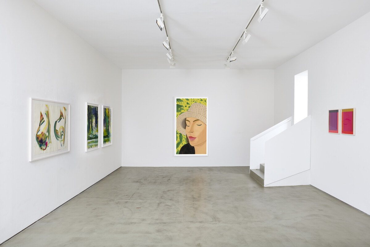
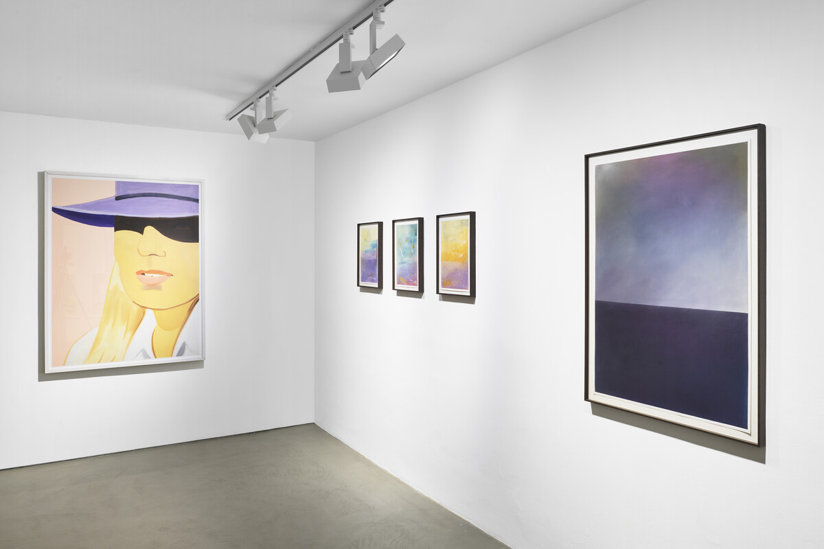
Between the expressively intensified paintings on the one hand and the more constructive or reductively planar compositions on the other, the works of Carsten Fock occupy an atmospheric intermediate position. The sheets from 2022, pastel on paper, show layered color fields in which pronounced horizon lines structure the space without fixing a concrete topography. In a smaller format, there is almost the impression of an autumnal landscape with rising kites; in a larger vertical format, the mood darkens into an image of a black “sea” zone beneath a veiled sky. Light and darker areas lie atop one another, rubbed sections meet fine strokes, and small accents of color introduce airy, floating signs. Precisely because the sheets are so delicately and filigree-like executed, they appear fragile, captured in a moment of transition. The motifs seem suspended; from this emerges a quiet restlessness, a careful openness that lends the works their tension.
Alex Katz and Imi Knoebel approach the medium of paper, or rather the flat picture support, quite differently. Here, clear decisions about form and surface take center stage. In Alex Katz’s case, the exhibition spans early sheets such as “Vincent” and “O. T. Portrait” to the pigment prints “Straw Hat 3” and “Sunrise 1” from 2022. Even in the drawings, the head appears in close-up, the framing is tightly chosen, and individual parts are cropped. With a few restrained pencil lines, Katz develops delicate outline portraits in which the white of the paper carries much of the visual effect. The later pigment prints push this concentration into a deliberately poster-like, almost graphic language. Female portraits fill the pictorial space, with backgrounds reduced to a few clearly separated color fields. Modulation and detail are largely withdrawn; the heads appear like large-format signs reminiscent of billboard aesthetics. Katz is less interested in the psychological probing of figures than in their appearance in the moment. Everyday motifs become pictorial signs in which proximity, distance, and surface are recalibrated.
Imi Knoebel’s “Anima Mundi” works oppose this figurative and color-field painting with the rigor of constructive abstraction. In the two sheets of the series, color and form are reduced to simple geometric elements such as rectangles and bars. Acrylic paint is applied to a smooth plastic film whose surface lends the tones a dense and luminous quality. Crucial is the relationship among the color values: light and darker, muted and saturated tones are arranged so that a balanced yet tension-filled structure emerges. The fields do not stand isolated beside one another but are interlocked through proportion, edge progression, and slight offsets. The series title “Anima Mundi”—literally “world soul”—suggests that Knoebel is not engaged in mere formal play but in the idea of an inner connectedness reflected in the precise balancing of color and form.
Taken together, the exhibition reveals how differently artistic approaches unfold on paper, from calculated chance in color processes to gestural and figurative intensifications, to landscape allusions and constructive order. What the works share is that paper, as a sensitive support, renders every decision in color, line, and form immediate, in painting, drawing, printmaking, and experimental methods. Paper is the place where a thought becomes visible. In “Editions & Paper,” one can trace how diverse this visibility can look today.
Dr. Veit Ziegelmaier
Photo credit: Produktion Pitz


